Thursday, August 12, 2010

Tras Can Project - 3d scanning

The first task we were given was to find a piece of trash or small object around the architecture building that we would then take to the 3d scanner. The result of the scan would be our main source of insperation in designing our trash can. 
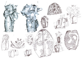
I was advised by my tutors to choose objects that would produce random irregular shapes in the scanner, eventualy the object I decided to scan consisted of a split acorn with wood shavings stuffed into it, as I was interested in the form that it might produce. The Picture above shows the results of my scan and a series of design sketches which I used to explore concepts. Looking at the scan I was interested in the juxtaposition of smoothe and rough surfaces thus giving me the idea of using a sleek clam shaped design which clamped the trash in order to store it.

I further developed my design on 3DS max as seen by the pictures above. This refined design is especialy made for storing a variety of cards and boxes. The main gap down the middle of the trash can allows for the oversized pieces of card board to stored, where as the gaps in the outer shell of the trash can allows smaller bits of card to also be stored and seperated from the lager pieces. I designed my trash can to especialy catter to large pieces of card because I think they have to potential to be recycled and reused in different assignments rather than being thrown away which I see all too often.


Tuesday, June 22, 2010

Exterior


The exterior of my design is finally finished! Daniel Libeskind's had great reference to ships as it was appropriate due to the location in the Great Cannal Dublin Docks, however he also gave it a modern twist almost resembleing a UFO space ship. A fusion between old and new ships which is symbolic in representing the generation gap between the building and its surroundings. These ideas come through in my own design. The trapezium shapes of the exterior shell has the qualities of a ships hull but combined with the stark sharp edges it looks more like a vessel for space pirates. This aesthetic is also shown through the glowing red column piercing the hull of the building which represents the mast of the ship. Similar mast shaped columns are on the glowing walkway to the entrance which are representative of the sunken ships left in the trail of the vessel. The orgional designer of this walkway said it was glamorous like walking on a red carpet, how ever my interpretation is more of the conqouer leaving a trail of blood from battle.

There is also a sense of chaos.. Libeskind's design has a facade made up of many beams ciss crossing each other, and he said this was to represent a collision of ships. I also repeated this idea as is seems in some areas that the hull of my building is broken by the windows sticking out of the shell of the building as if it had jus collided head on into a reef.

construction


Now that I had the textures and my foundation it was time to start putting up the walls. each wall is different and unique awhich required alot of pressision and patience to place the trapeziods in the right location. looking through the pictures in the Riba journal I saw that parts of the exterior shell of the building were spaced apart by windows, a feature which I interpeted into my own design.


custom textures

I take pride in the fact that all my textures have been custom made in photoshop and tweaked in second life as we were in couraged to do by our lecturer. Not using the default prims already in my inventory and making my own made my design uniuqe! and I was able to save prims! Instead of constucting each window induvidaly I was able to save both time and prims by drawing the window on photoshop. The windows consisted of a frame which I made in photoshop with transparent gaps between the windows I put very opaqe snapshot of the surroundings to give the illusion of reflections. I was happy with the result as it had a much more realistic effect. The copper looking facade is a grunge texture I found online at brusheezy.com an excellent site for free photoshop brushes ect.. then I simply made the appearacne more glossy and darker. The purple dotted and red stripped carpet in the main office is similar to that of the real buildings but jus a bit more louder.

entrance facade

The next step of my design was to build the entrance which were made of 10m x 0.3m high cubes. They had to be taperd in order to get the trapezium shape and large eves which mimic that of the Grand Canal Theatres.

foudations

One of the distinctive features on the Grand Canal Theatre is the red light up walkway. This is walkway is where I started my design. The pattern on the walkway of my design is similar to the oridginal however I decided to take advantage of the freedom in secondlife and make it a bit more detailed. The root pattern is made by an alpha channel which I drew in photoshop, then place over a glowing prim of the same size so that the light would shine through the transparent layer. Then I proceeded by building walls around the foot path and also the floor of the main building.

restart

After my minor set back which consenquently costed me two presious days I had to head back to the drawing board to find a suitable site to build on.. The exact task I was trying tho avoid in the first place. Never the less I found a good spot although litterd with random prims I saw potentiol.